 A picture is worth a thousand words, so goes the justification for graphic novels. I kid, I love the hell out of graphic novels but now I’ve been sidetracked and this is only the second sentence of this post.
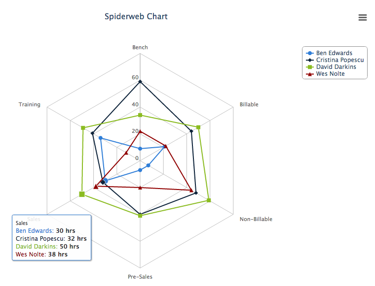
So, the Analytics API. I’m pretty enamoured with it as it seems is Pat Patterson, and I think that it’s one of the most useful features the platform has ever made available. Presenting the right chart (or set of charts) to a manager or executive can empower them to make business decision in minutes, powerful stuff. To that end myself and a few of my fellow Tquilites have begun building an opensource library of Analytics API demos to aid you in aiding your clients/managers/execs.
Below I’ve included a few introductory steps to help you get started. To start with you’ll need the code from github.
Step 0
I’ll be stepping through the Google Charts Stacked Bar Chart example from github so you’ll be able to test this out yourself.
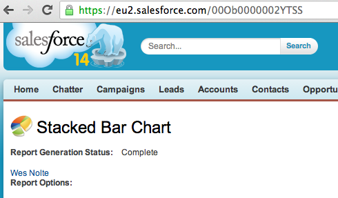
Step 1 – Create a report
Certain report formats map well to certain chart formats so make sure you choose the right type of report. For example, stacked bar charts map well to matrix reports, summary charts map well to pie charts.
Once you have created your report and have some interesting data, determine the report ID and keep it somewhere safe. Report IDs always start with “00O”.
Step 2 – Create a Visualforce Page
As it says in the heading of this section, create a new VF page. Easy peasy lemon squeezy.
Step 3 – Include the chosen JS library
As with any web-based language you’ll need to include the JS library that you want to use. I’m going to use Google Charts in this example. Note I’m also using jQuery to make the AJAX callout.
[code language=”JavaScript”]
<script type=”text/javascript” src="https://ajax.googleapis.com/ajax/libs/jquery/1.10.2/jquery.min.js"></script>
<script type="text/javascript" src="https://www.google.com/jsapi"></script>
[/code]
Step 4 – Call the Analytics API
The API call can be made server-side or client-side, with this example making use of a client-side call.
[code language=”JavaScript”]
/** Fetch the JSON data representing the the report **/
var jsonData = JSON.parse($.ajax({
beforeSend: function(xhr) {
xhr.setRequestHeader(‘Authorization’, ‘Bearer {!$Api.Session_ID}’);
},
/** You’ll need a URL parameter key called "id" that has a Summary Report id value **/
url: "/services/data/v29.0/analytics/reports/{!$CurrentPage.parameters.id}",
dataType:"json",
async: false
}).responseText);
[/code]
The results of the callout are fed into the callback function and available through the variables “ai” and “ae” (see below).
Step 5 – Parse the resulting JSON & build the required data structure
The structure of the JSON depends on the report type but is fairly simple to understand. Be sure to use console.log() to investigate what’s going on if you get stuck.
[code language=”JavaScript”]
var chartData = new google.visualization.DataTable();
chartData.addColumn(‘string’, ‘Stage’);
$.each(jsonData.groupingsDown.groupings, function(di, de) {
chartData.addColumn(‘number’, de.label);
});
$.each(jsonData.groupingsAcross.groupings, function(ai, ae) {
var values = [];
values.push(ae.label);
$.each(jsonData.groupingsDown.groupings, function(di, de) {
values.push(jsonData.factMap[de.key+"!"+ae.key].aggregates[0].value);
});
chartData.addRow(values);
});
[/code]
Step 6 – Generate the chart
Finally invoke the drawing of the chart along with any options required.
[code language=”JavaScript”]
var options = {
title: jsonData.attributes.reportName,
vAxis: {title: jsonData.reportMetadata.groupingsAcross[0].name},
isStacked: true
};
var chart = new google.visualization.ColumnChart(document.getElementById(‘chart’));
chart.draw(chartData, options);
[/code]
Voila! You now know the basics of building custom charts in Visualforce (or any other web language) using the Analytics API. To try this out log into your Org and then browse to:
[code language=”html”]
http://[your salesforce instance]/apex/YourPage?id=[reportId]
[/code]
Feel free to use this code anyway that you can imagine and we’d be over the moon if you contribute your own awesome to what we’re building. Fork us on github.
Hi Wes,
Could you pls let us know how to make use of Analytics API as we can’t find any code regarding this API in the repository except some Metadata information regarding reports.
Sanchit
I updated the post last night to include more detail but forgot to post it!
Just shared on LinkedIn, thanks!
Code below shows dynamically sizing and displaying desired column.
Usage: http://[your salesforce instance]/apex/YourPage?id=[reportId]&col_numb=# desired column number.
Cheers,
-Ray
// Note: aggregates[#] is dynamically sized with var ‘size’.
var max_col = jsonData.factMap[index.toString()+”!T”].aggregates.length – 1;
var show_col =
console.log(col_numb);
if (show_col != ‘default’) {
dataArray.push([grouping.label, jsonData.factMap[index.toString()+”!T”].aggregates[show_col].value]);
} else {
dataArray.push([grouping.label, jsonData.factMap[index.toString()+”!T”].aggregates[max_col].value]);
}
Hi Wes – thanks for the post. Is the BubbleChart class available? It’s not available in the GitHub repo. Many thanks, Andy